Interactive and Animated Plots
Chris Papalia
5/14/2020
library(tidyverse)
library(lubridate)
library(ggrepel)
library(knitr)
library(lubridate)
library(plotly)
library(gganimate) # install.packages(c("gifski", "av"))
Interactive Plots Using Plotly
Let’s start by loading the data from the Johns Hopkins Dataset. This is the same dataset we’ve worked with in the past.
covid_cases <- read_csv("https://raw.githubusercontent.com/CSSEGISandData/COVID-19/master/csse_covid_19_data/csse_covid_19_time_series/time_series_covid19_confirmed_global.csv")


covid_deaths <- read_csv("https://raw.githubusercontent.com/CSSEGISandData/COVID-19/master/csse_covid_19_data/csse_covid_19_time_series/time_series_covid19_deaths_global.csv")
As usual, we’ll need to reshape, rename, and tidy the data to make it useful in plots. With some help from Eric Green and his website, the method section I have done this a little differently than in the past.
covid_deaths_tidy <-
  covid_deaths %>%
  pivot_longer(cols = 5:ncol(covid_deaths),
               names_to = "date",
               values_to = "deaths") %>%
  mutate(date = mdy(date)) %>%
  set_names(tolower(make.names(names(.)))) %>%
  select(-lat, -long) %>%
  filter(country.region != "Diamond Princess")
covid_cases_tidy <-
covid_cases %>%
pivot_longer(cols = 5:ncol(covid_cases),
names_to = "date",
values_to = "cases") %>%
mutate(date = mdy(date)) %>%
set_names(tolower(make.names(names(.)))) %>%
select(-lat, -long) %>%
filter(country.region != "Diamond Princess")Making an Interactive Plotly Plot
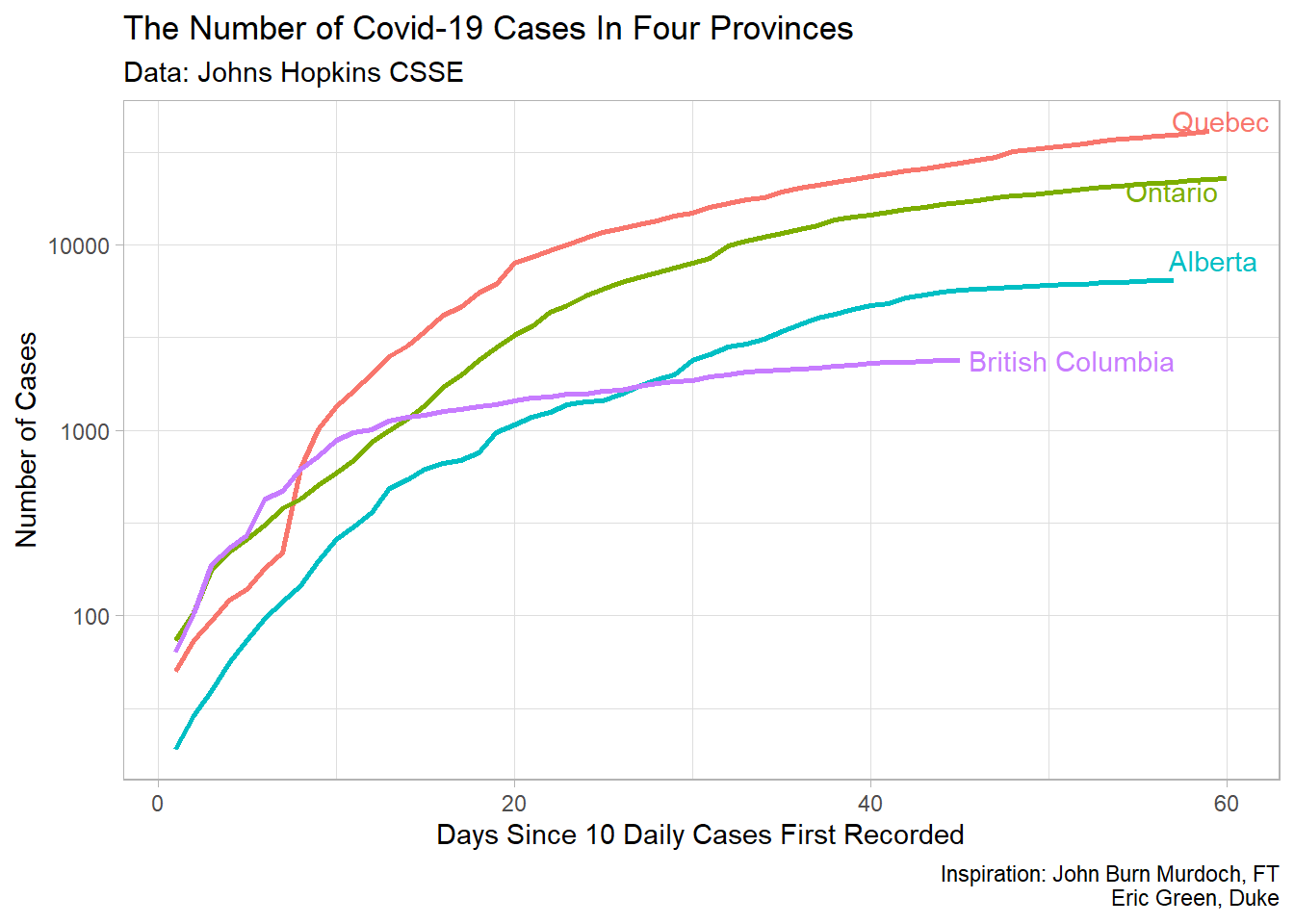
The plotly package allows us to turn a regular plot into an interactive graphic that has features like tool tip and zooming. It can be quite useful when presenting information on a webpage. So, we’ll use a plot that we’ve looked at before and make it interactive. In the first weeks, we made a provincial plot like the one below.
The beauty here, is that with only one line of code, we can turn that previous plot into an interactive plot. We simply need to call the ggplotly() on the object that we create of our last plot. Let’s see how this interactive plot looks. You can experiment with the tooltip functions and zoom functions.
Province_plot <-
covid_cases_tidy %>%
 filter(country.region %in% c("Canada")) %>%
  group_by(province.state) %>%
  mutate(daily_cases = c(cases[1], diff(cases))) %>%
  filter(daily_cases >= 10) %>%
  mutate(days = 1:n()) %>%
  mutate(label = if_else(days == max(days),
                         province.state,
                         NA_character_)) %>%
  ungroup() %>%
  mutate(province.state = fct_reorder(province.state, -cases)) %>%
  filter(province.state %in% c("Quebec", "Ontario", "British Columbia", "Alberta")) %>%
  mutate(Province = province.state,
         Date = date,
         Days = days,
         Cases = cases) %>%
  ggplot(aes(Days, Cases,label = Date, colour = Province))+
  geom_line(size = 1)+
  scale_y_log10()+
  theme_light()+
  theme(legend.position = "none")+
  labs(title = "The Number of Covid-19 Cases In Four Provinces ",
       x = "Days Since 10 Daily Cases First Recorded",
       y = "Number of Cases",
       subtitle = "Data: Johns Hopkins CSSE",
       caption = "Inspiration: John Burn Murdoch, FT\nEric Green, Duke")

ggplotly(Province_plot)
We were able to add labels to the tool tip functions by adding them as labels in the ggplot() aesthetic. Notice that I also mutated the variables to be presented more nicely in the tool tip. You can play around with these if you’d like.
Creating an Animated Graphic
Now, we’re going to try and make an animated plot using the cases data. You may have seen plots like these online before. We’ll start by getting our daily case data for each country and assigning it to an object called case_plot
case_plot <-
covid_cases_tidy %>%
  select(-province.state) %>%
  mutate(Country = country.region) %>%
  group_by(Country, date) %>%
  summarise(cases = sum(cases)) %>%
  ungroup()
Then, we need to create a rank for each country, each day, and create a list of labels and information that we’ll use in the plot.
leaders <-
case_plot %>%
  group_by(date) %>%
  mutate(rank = rank(-cases),
         relative_to_1 = cases/cases[rank ==1],
         label = paste0(" ", cases)) %>%
  arrange(rank, Country) %>%
  mutate(rank = 1:n()) %>%
  filter(rank <= 15) %>%
  ungroup() %>%
  mutate(month = month(date, label = TRUE, abbr = TRUE),
         day = day(date),
         monthDay = paste(month, day, sep = " "))

monthDayLevels <-
leaders %>%
  distinct(date, .keep_all = TRUE) %>%
  pull(monthDay)
Now that we have this information, we’ll create a static plot with all the information on it, and then use the animate function to make it come to life.
static_plot <-
leaders %>%
mutate(monthDay = factor(monthDay,
levels = monthDayLevels,
labels = monthDayLevels)) %>%
ggplot(.,aes(x = rank, group = Country, fill = Country, colour = Country))+
geom_tile(aes(y = cases/2, height = cases, width = .9), alpha = .8, colour = NA)+
geom_text(aes(y = 0, label = paste(Country, " ")),
vjust = 0.2, hjust = 1, size = 10) +
geom_text(aes(y=cases+50, label = label, hjust=0),
size = 10) +
coord_flip(clip = "off", expand = TRUE) +
scale_x_reverse()+
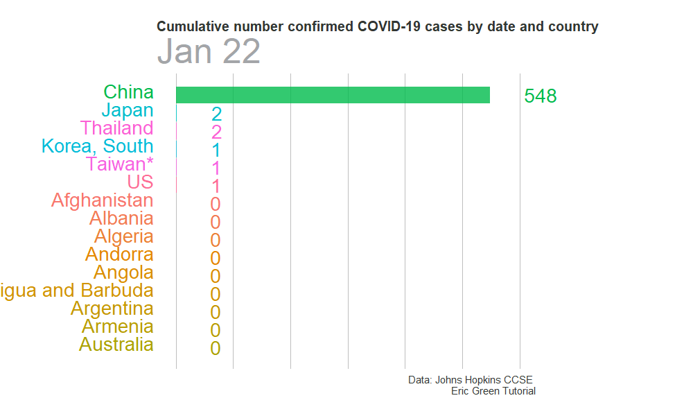
labs(title = 'Cumulative number confirmed COVID-19 cases by date and country',
subtitle = '{closest_state}',
caption = "Data: Johns Hopkins CCSE \nEric Green Tutorial")+
#scale_fill_viridis_d(option = "plasma") +
#scale_color_viridis_d(option = "plasma") +
theme_minimal() +
theme(axis.line=element_blank(),
axis.text.x=element_blank(),
axis.text.y=element_blank(),
axis.ticks=element_blank(),
axis.title.x=element_blank(),
axis.title.y=element_blank(),
legend.position="none",
panel.background=element_blank(),
panel.border=element_blank(),
panel.grid.major=element_blank(),
panel.grid.minor=element_blank(),
panel.grid.major.x = element_line(size=.4,
color="grey" ),
panel.grid.minor.x = element_line(size=.1,
color="grey" ),
plot.title.position = "plot",
plot.title=element_text(size=20,
face="bold",
colour="#313632"),
plot.subtitle=element_text(size=50,
color="#a3a5a8"),
plot.caption =element_text(size=15,
color="#313632"),
plot.background=element_blank(),
plot.margin = margin(1, 8 , 1, 8, "cm"))We are setting the paramters for how we want to animate the plot and what transitions will look like.
animate_plot <-
static_plot+
  transition_states(monthDay,
                    transition_length = 4,
                    state_length = 1)+
  ease_aes("cubic-in-out")+
  view_follow(fixed_x = TRUE)
Now, we’ll create a .gif
animate(animate_plot, fps = 10, duration = 50, width = 1000, height = 600, renderer = gifski_renderer("anim/gganim.gif"))